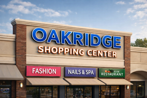

A shopper pulls into a Muskegon retail lot, parks at the far end, and looks up at the row of storefronts. From back there, they read one sign clearly and head for it. That first read is what a bold storefront display is for. So the real test of a bold sign is plain: does it read from the spot your customers first see it? At Grand Rapids Sign Company, we build storefront signs for Muskegon retailers from our Walker shop, and the boldest-looking option is not always the one we recommend.
Set the Letter Height to the Viewing Distance
Before you pick a size, find the spot where customers first lay eyes on your storefront, whether that is the far edge of the lot or the sidewalk across the street. Measure how far back it sits. That distance is the starting constraint on how tall your letters have to be, because letters that read from the doorway can disappear from across a lot. Set a height that clears that distance first, then fit your words and any decoration inside it. Your local sign code limits how big and where a sign can go, so the height you choose has to fit inside what your building allows.
Distance is the first factor, though contrast, lighting, and letter shape affect the read too. Height is the number you settle first, and the other choices follow from it. Clear the distance, and you open real room to be bold with color, contrast, and finish. You still confirm those on the actual face before you approve the design.
Stand at the Spot and Read It Yourself
You can check a design without special equipment. Mock up the wordmark at the size you are considering, put it where the sign will go, and walk out to where customers first see you. Read it from there without leaning in. If you catch yourself squinting or stepping closer, the letters are too small or the contrast too weak for that distance. If it reads on the first look, the height clears the distance, and you can move on to color and finish.
Fit the Words to the Height You Have
Your storefront face has only so much room, and height, word count, and decoration all take from the same space. Push the letters taller and you have room for fewer words; add a busy graphic and every element shrinks. Since the read depends on height, the trade usually goes one way: cut the message to the few words that matter and let them stand tall. A shop name and one clear descriptor, sized to your distance, usually reads faster at a glance than a full sentence crammed to fit. We often steer you toward a simpler display that reads better at your distance.
At Night, Aim for Clean Separation
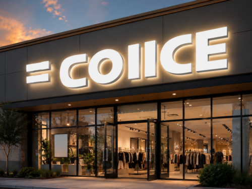
If your sign will be lit, judge it after dark, because a face that looks sharp at noon can look different once its own light is on. At night, what carries the message is clean separation between the letters and the background. Past a point, glare and bright hot spots can reduce that separation. Where you see glare or a hot spot, the usual fix is to even out or ease back the light. Illuminated channel letters are built as individual lit units, so you have room to even out the light across the face.
Test the Real Face Before You Approve It
A design that looks bold on a screen is a flat picture under even office light. The installed face is another matter, because real finish, gloss, and texture change how the color separates in real light. Strong light-dark contrast can help your letters stand off the background, while a glossy or metallic surface can throw glare that softens that separation. So before you approve materials, ask for a production-representative sample and set it in the light it will live in. Step back to your distance and confirm the letters still separate cleanly; if they wash out, change the finish or push the contrast.
When a Decorative Letterform Needs More Room
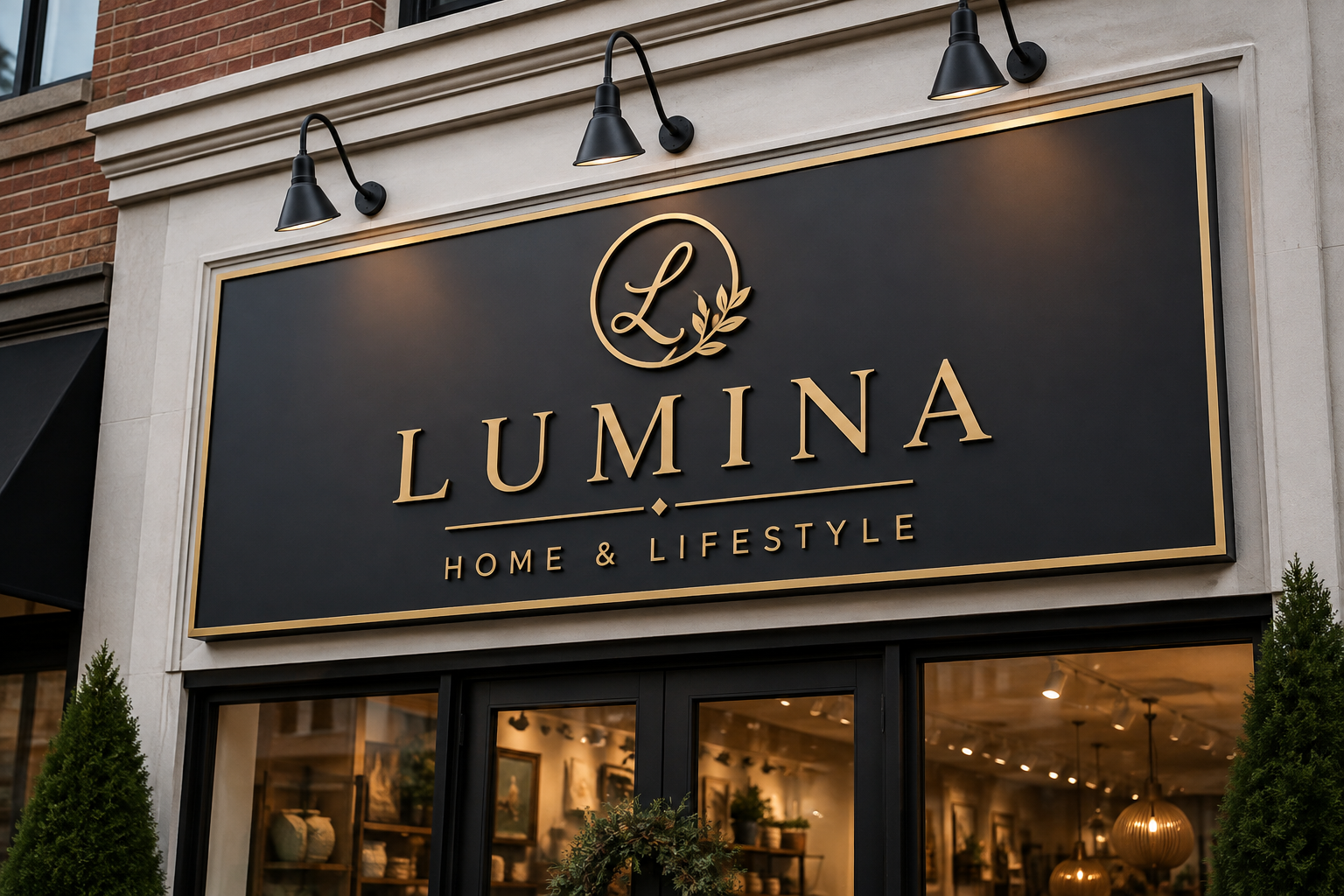
Brand fonts are part of what makes a storefront yours, and we match your logo and lettering. A script or heavily decorated wordmark can be harder to read than a plain one, and it may need more height or a longer look to land at the same distance. Test your actual letterform at your size and distance. If it reads at your distance, keep it. If it only reads when someone slows down or steps closer, and your spot is already at its limit for height and dwell time, enlarge it or simplify it a touch.
When you are ready to size a real display, send us one photo: your storefront shot from the exact spot a customer first sees it, whether that is the back of the lot or across the street, with a note on how far back that is. From that frame and distance, we size the letter height first, then work out the color, light, and lettering. Call Grand Rapids Sign Company at (616) 284-8739 to start. Get the height right for that distance, and the shopper at the far edge of the lot can read you first.